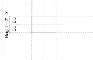
Saturday, June 30, 2012

Sneak Peek: Rotating Curtain Panels

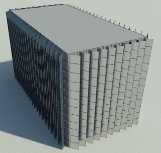
Here is a quick view of a pretty cool parametric curtain wall system I created.  The system allows each panel to be adjusted independently to create a design, and then rotated all at once to create an animated effect. I plan on breaking down how it was created in a future post, but for now a few images to get a taste of what is to come.

Curtain Panels all set at 0º
Curtain Panels all set at 45º


Curtain Panels set at 10º intervals in different patterns


Curtain Panels set at 20º intervals in different patterns


Note: These GIFs were created by exporting each frame (adjusting the rotation) then animating in Photoshop


6' Panels 5º intervals vertical pattern


3' Panels 5º intervals diagonal pattern (low res.)
Close up: 3' Panels 15º intervals diagonal pattern


3' Panels 10º intervals alternating vertical pattern

Monday, June 18, 2012

Door Design Options

This post will be a bit of an introduction to nested families, I think I will cover a more in depth look at this family in a future post but for now some pretty pictures with some added descriptions.


Two variations of a door touched up in Photoshop


My main goal for this Revit door family was to create one single family that can be the equivalent of multiple families, or in other words I wanted a simple "all in one" door family, that the user can choose what type of door and what type of hardware.


Now what I have created so far is still in its beta state (some of the parameters are a bit finiky) so it has yet to be used in an actual project.


Essentially what I needed to do in order to create this family was to individually model each variation, then load them into the main file and apply a label parameter so that the user can choose which model to use.


For the door panel imparticular I created the base model first with no openings, and applied the appropriate parameters and then did multiple "save as" versions in which i created the different openings, making sure that all the parameters were consistant so the panels would flex appropriatly in the main file.


When the model is finished I want the user to be able to choose the following:
  • Door panels (as of now 11 variations)
  • Door hardware (as of now 5 variations)
  • Door jambs (as of now 1 variation)
Parameters are very important to keep consistant because I also want the user to be able to flex the following without the file instantly breaking:
    
    My parameters so far (still misssing a bunch)
    
  • Door width
  • Door height
  • Door, hardware, and jamb materials
  • Open/close the door in 3D views
  • Possibly alter the dimensions of the openings if necessary


Another thing I wanted to consider when making this component was accuracy in regards to sections. So instead of modeling a plain extrusion for the panel itself I decided to break it up as if it was actually constructed.


One of the down falls of making this "super family" is file size, this family is much larger than the average door family making the initial load time of loading in the project fairly lengthy, however manipulating the family once it is loaded isnt outrageous compared to that of a standard family.

Wednesday, June 13, 2012

Detailed Beyond All Reason

This is just a quick post to show off a few circuit boards I modeled for a client a while back (and went a little over board with), I'm not going to go into the details how they were modeled (mostly just nested families of individual pieces).


Alot of the detail within these components is just an illusion brought on by a texture of the circuit board itself underneath the components that I modeled


In order to make the model remotley useful I hid some of the geometry based on the detail level of the view (so it didn't bog down the program and you can actually see whats going on), and hid most/all of the geometry in plan/elevation and used symbolic lines to denote and label all the required connections.

Tuesday, June 12, 2012

Working with Windows

Sorry about the delay in posts, sometimes its just hard finding the time. Hopefully, I will be able to post more frequently in the future.

Today I decided to share a few windows that I made a while back.
These windows don't seem too complex at first glance and rightfully so, when broken down they only contain a few sweeps with a few sets of parameters controlling them.


However, when they are cut in section you can see the detail that went into each window
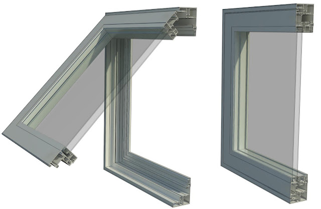
Awning Window: 3D Section
My main goal for these windows was to test if I could use the actual profiles supplied by the manufacturer, so that not only would the window look good in 3D but would display accuratly in a section view as well

In section these windows look more complex then they actually are, It only took a few easy steps to get the desired result:

First I set up a basic rig using reference planes and set up parameters to control the width, height, and offset from the edge of the wall.
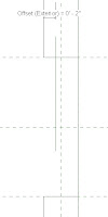
Left Elevation

Exterior Elevation


I then downloaded the profile from the manufacturer and imported the image into the left elevation of the project and scaled it to the approriate size.


I then went to the exterior elevation and created a sweep along the reference planes I created and locked them together.

For the profile of the sweep I traced over part of the manufactures profile getting as close as possible to ensure accuracy


This is the resulting sweep from the profile above:
My next step was to create a reference line with an angle parameter to host the portion of the window that opens.  I then repeated the above steps to create the next portion of the window and flexed the parameters to make sure they worked, with the results below:


The final steps included creating the glass which I extruded then constrained to the angle parameter to make sure it followed with the opening of the window and applied the materials and parameters to change them.


I basically followed the same procedure for the other windows with a few variations in parameters for the double hung and slider windows so I could control the openings. Here are some 3D sections of the other windows I modeled:


Basically what I hope you get from this post is that sometimes it does'nt take that much more work to go the extra mile and create a much more detailed component.  By going a little further and using the actual profile supplied by the manufacturer, it creates a more accurate window, and it takes much less time to create an actual architectural section of that wall, (however, it will still need some touching up) while also creating great views when the building is cut in 3D.

Friday, June 8, 2012

Something Simple

I figured my first real post should be something simple that looks good.
So what can be more simple than a box, but not just a plain boring static cube.

How about a fully parametric cardboard box that can open and close and renders realisticly.
Now thats more like it!


I started this mini project out by first creating the rig of reference planes, no different than I would with any other component I would create.  I created the parameters for the Height, Width, Depth, and Thickness of the box.


Floor Plan: Ref. Level


Front Elevation


Along with the reference planes I created four reference lines at an angle in which I would host the flaps of the box and gave these refrence lines angle parameters so I could control if the box would be open or closed, or anything in between.

Here is what all my parameters looked like when i was finished (I added aditional parameters to control the gaps in between the flaps, and a yes/no parameter to easily open and close the box.)


Now that my rig was finished I started to extrude each of the sides as well as the flaps that will open and close.  Instead of using just the Solid Extrusions, I opted to use Sweeps so I could avoid the sharp edges that extrusions create. For the path of the sweep I was sure to fillet the corners, again, to avoid the sharp edges. Here is the result:


Its one thing to make a parametric box, but it takes a little more work to make it into a parametric "cardboard" box.  In order to give the model the physical appearance of cardboard its off to the materials window.  But, whats this? Revit doesn't come standard with a worn down cardboard material, how dare they!  Well I guess we need to make our own.  For my material needs I tend to go to http://www.cgtextures.com/ but there are plenty places out there to find tileable materials.  For this project I used a simple cardboard material, and a plastic material for the bump material to give it the worn down look:

Cardboard Material
Plastic Material
 And with the materials all set we only need to adjust the scale to something that looks appropriate and Wallah we turned a parametric box into a parametric "cardboard" box. 

Now, in the end I decided to turn almost all of the parameters into instance parameters so I could easily populate a scene with any size box by quickly stretching each of the sides.


Now you may say to yourself why bother making a box, I will never use that.  Well, that may be the case, but the lessons you learn when creating something greatly impact the work you do later on,  By starting simple you ensure yourself the ability to overcome the challenges that come with the model and learning from the mistakes you make. As the saying goes you must crawl before you can walk, and walk before you can run.


If you want to download the file you get it here:
http://www.revitcity.com/downloads.php?action=view&object_id=11639


As this is my first official post feedback is greatly encouraged on how to improve the content I provide, and I welcome it with open arms.

Inaugural Post

Welcome to my blog! Revit: Down to the Details

First a little bit about myself:
I am a Revit Certified Professional from Syracuse NY, and I work as a designer for C&S Companies.
I have a bachelors in Architectural Technology, and have been using Revit for about 5 years.
I pride myself at being very efficient at creating Revit components and sometimes going a bit overboard when it comes to creating some of the details of the object.

This blog will mostly feature the component side of Revit, showing off some high quality/highly detailed Revit components, and occasionaly tutorials on how they were created.  I wanted to create this blog to put myself out there, and to show that Revit is capable of creating highly detailed, realistic components when done the correct way.

That's it for now, and I leave you with an image of one of my first ever Revit components, one of the hardest parts when creating this was figuring out exactly how i wanted to emboss the text.